Statistics
Geomapping LAPD Hate Crime
Geographic Information Systems (GIS), such as ESRI’s ArcMap software, allows researchers to create detailed maps of their data, allowing for a better understanding of potential trends and patterns in the data.
These maps also allow researchers to present their results in a visual format which can communicate their findings more clearly.
For the purposes of the Hate Crime Research Project, ArcMap was used to map the occurrence of hate crimes and compare them to non-spatial, demographic information about the corresponding area in which the crimes occur.
This allowed us to map several hate crime factors such as severity, community impact, and demographic information in comparison to hate crime occurrence.
It is important to note when viewing these maps that not all areas pictured in the maps report to the Los Angeles Police Department as several of the areas have their own police departments. Thus, the absence of hate crimes in a particular area on the map does not necessarily indicate that a hate crime/incident wasn’t reported in that area during 2004. These maps allow users to get a general idea of the presence and absence of hate crimes in Los Angeles in comparison to various factors.
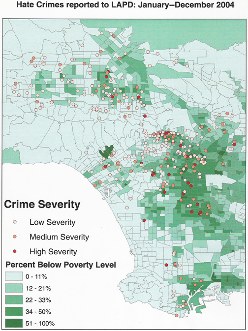
Crime Severity and Percentage Below Poverty Level
Map 1. Hate Crimes Reported in Los Angeles in 2004: Crime Severity and Percent Below Poverty Level. This map includes hate crimes reported to the Los Angeles Police Department during 2004 by location. Each circle represents a hate crime/incident occurring at that location. The color of the circle represents the level of severity present in the hate crime/incident, as identified by the research team using the Cormier Lang Scale. Also featured in this map is the percentage of the population below the poverty level by census tract. Each census tract outlined in the map of Los Angeles is colored a shade of green representing the percentage of residents in the census tract who are considered below the poverty level based on the 2000 census.
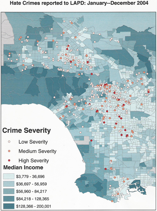
Crime Severity and Median Income
Map 2. Hate Crimes reported in Los Angeles in 2004: Crime Severity and Median Income. In this map, each circle represents a hate crime/incident reported to the Los Angeles Police Department in 2004. The color of each circle represents the severity of the hate crime/incident, as coded by the research team using the Cormier Lang Scale. Also included in this map is the median income level of residents in Los Angeles County by census tract. For each census tract outlined, the shade of blue corresponds to the average median income of residents, as noted in the legend.
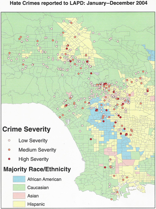
Crime Severity and Race/Ethnicity Majority
Map 3. Hate Crimes reported in Los Angeles in 2004: Crime Severity and Race/Ethnic Majority. This map also includes hate crimes reported to the Los Angeles Police Department in 2004 and the color coded level of severity present in the crime. The color of each circle represents the severity of the hate crime/incident, as coded by the research team using the Cormier Lang Scale. Additionally, the racial/ethnic majority of the population by census tract is included. For example, areas shaded blue on the map represent census tracts in which the majority of population is African American (as reported by the 2000 U.S. census).